Induction.
Examining filmmaking conventions.
John Ford's the Searchers (1956) is a classic example of impeccable cinematography, as is the bulk of Ford's work.
In the 'welcome home Ethan' scene, there are three distinct backgrounds; the desert, the porch, and the kitchen, all of which have different features, but all of which are exceptionally utilised to frame every shot.
The shot above is divided by the rule of threes both vertically and horizontally, with darkness consuming both outer thirds vertically and the uppermost third horizontally. The central and lowermost horizontal thirds are divided by the horizon of the landscape, and the subject of the shot, Dorothy Jordan's 'Martha', is framed in the direct centre. The shot tracks directly in that pictured on the right, in which Martha herself helps divide the centre and leftmost vertical thirds, with the distant plateau in the far right of the shot discerning the rightmost third, within which it sits.
The Searchers, Warner Bros. Pictures, 1956.


The next shot, pictured left, divides the shot by three both horizontally and vertically again. The vertical thirds are discerned by the wooden beam and Martha, both of whom fall directly on the dividing lines, rather than within the segments themselves. I'm personally a fan of arranging shots this way, with subjects falling on the gridlines rather than housed within the sections, as - while it is subjective - I find it a much more attractive way of framing a shot.
Horizontally, the grid is determined by Martha's face and chest, the perfect example of framing a character in a medium shot.
The shot pictured right once again uses the towering plateaus in the background to determine the outermost thirds, framing them as the subjects of both thirds. In the centre, John Wayne's 'Ethan Edwards', slowly approaching the viewer. Once again, the shot is divided by nine, with horizontal grid broken up by the horizon line and the washing hanger in the foreground.
Simply put, the next shot is nothing short of stunning. The faces of the actors aren't visible in the shot, but the emotion is palpable, and most of that is achieved through the way the framing of the shot is achieved. Each character moves tentatively into their place one by one, gradually composing the shot themselves. The subjects of each vertical segment, Aaron, Martha, and Pippa Scott's 'Lucy', portray the most emotion, as the older Edwards' who knew Ethan long before he left. Martha and Aaron were also the subjects of the previous shots, and in a shot closely following Lucy is centre-frame, delivering the first line of the scene, which is to introduce Ethan to his nephew.
The shot pictured left begins slightly differently. Martha's place is maintained, but Walter Coy's character 'Aaron' enters the shot and stands beside her, falling on the vertical gridline that divides the centre and rightmost section. He steps down off the porch and the shot pans out to follow him, Martha maintaining her place on the leftmost dividing line, but Aaron stepping into both the foreground and the direct centre of the frame. As he does so his face is illuminated by sunlight, making clear that he is the subject of the shot, and that his reaction to seeing Ethan in the distance is the notable performance.


Once again, the featured characters fall on the dividing lines of the segments, rather than within them, with Aaron even helping discern the lowermost horizontal segment as the line follows his shoulder. The ground, being a desert, is comprised of very little detail, and the sky is entirely negative space. This comes together to help draw the viewer's attention to Ethan and Aaron.
Ethan is also backlit which, along with the context, lends the shot a vague tension, as it presents Ethan as a stranger, and somewhat imposing.
This impression of Ethan is offset in his next appearance, as he steps into the light and, as he approaches Aaron, any trepidation gradually fades and he is greeted with warmth and eagerly led over to the rest of the family.
While the framing doesn't change, Ethan moves from the dividing line of the grid to the direct centre of the frame.


In the next shot, the characters are confined into the centremost horizontal third by the roof of the house and the fence in the bottom of the frame. Within the centremost vertical third Ethan, Aaron, and Martha are focused on, brightly lit by the sun and giving the most active performances. In the shade of the porch and the outermost thirds is the rest of the family, whose gazes serve to reinforce the viewer's focus on the trio in the centre.
Inside of the Edwards' house, the backgrounds of the shots have much more content to utilise, and the presence of both more detail and more dynamic lighting creates for very visually compelling shots. In the shot pictured left, Ethan and Lana Woods' younger 'Debbie' are centre-frame, clearly illuminated and taking up almost the entire middle third of the shot. The upper horizontal third is comprised almost entirely of darkness. The leftmost vertical third is largely without detail, and the empty space helps guide the viewer to follow where Debbie is pointing. The rightmost thirds use the leading lines of the shelves to draw attention to Ethan and Debbie. Once the shot plays out and Debbie is pointing, there is a distinct leading line for the eye to follow, going along the shelves, to Debbie, the along her arm and along the crossbeam above the door.


In this shot, attention is drawn to Ethan specifically. Martha serves to divide the centre and rightmost thirds, while Ethan and Aaron serve as the subjects of the centre and leftmost. The righthand third is largely devoid of detail which, combined with the gaze of Martha and the leading line of the mantle in the background, sends the viewer's attention to Ethan. The background behind Aaron is shrouded in darkness, which achieves the same effect.
Jurassic Park, Universal Pictures, 1973
The scene I've chosen to analyse is taken from Stephen Spielberg's Jurassic Park (1973). In the scene, the characters are debating whether or not to shut down the system so that it can reboot at the risk of releasing all of the dinosaurs from captivity.
In this shot, the characters are framed by the computer monitors. All three characters in the central vertical third, and Samuel L. Jackson's 'Ray Arnold' is focused on in the direct centre, as he is currently delivering dialogue.


In this shot the grid is defined by the placement of Richard Attenborough's 'John Hammond', and Ray Arnold. They represent the outermost thirds, and framed between them is the problem they are attempting to overcome: the computer virus left by Wayne Knight's character 'Dennis Nedry'.
The virus is represented by a .gif file on the PC of Nedry wagging his finger. With this animation centred in the frame, Arnold delivers the line "I can't get Jurassic Park back online without Dennis Nedry."
Now clearly this shot is great for a number of reasons, but chief among them is how perfectly it's divided by three. The ladder on the lefthand side of the shot divides the centre and leftmost thirds, and the right is determined by steely gaze of Jeff Goldblum's 'Ian Malcolm'. The position of his arm serves as a leading line supposed to guide the viewer's eye to his face. Supposed to.


I like this shot. The distinct separation of Hammond from both Malcom, and Laura Dern's 'Ellie Sattler' by the entire centre third of the shot, combined with Sattler and Malcom's eyelines following the uppermost dividing line does a great job of representing the conflict between the characters. Add to that how well Hammond's head and shoulders, torso, and legs are broken up within the horizontal divisions, and you've got great shot.
The thirds in this shot are broken up by the position of Ray Arnold, and by the hanging cables to the left. Something I've noticed while going through this scene is Spielberg's tendency to use the props and environment in the scene to frame the shots, having used monitors, railings, and cables as ways to break up the shots. The use of the cables helps establish Hammond as centre-frame, and appropriately so, seeing as he is delivering lines. Additionally, Arnold himself also establishing the centre third helps keep him in focus too, which keeps the viewer interested in the conversation.


Once again, the vertical thirds are used to separate two parties with opposing viewpoints, as Bob Peck's 'Robert Muldoon' suggests waiting out the dinosaurs on account of Jurassic Park's 'lysine contingency', which ensures that the animals will die off shortly if not provided lysine by the keepers. All characters' heads are framed in the uppermost horizontal third, which lends itself to a good flow for the eye later in the shot when they all turn to face one-another.
Once again, Spielberg's use of vertical thirds to separate characters during dialogue rears its head. The angle of this shot helps deliver the subtext of the conversation too, with Arnold being literally talked down to. The contents of the scene's dialogue between Hammond and Arnold is almost entirely comprised of Hammond convincing Arnold to do what he wants, despite Arnold's moral and professional objections.


The shot pictured left is the kind that I love. Darkness and light playing off of each other to both frame the shot and make the subject very distinct. The details of Arnold's face are clearly illuminated in the darkest part of the frame, directly on the leftmost dividing line, and confined to the uppermost horizontal segment. On the right, head and shoulders framed in the left-centremost segment, is a silhouette, contrasted by the torch-beam and the light behind her.
This is another shot that plays with lighting really well. Again, both characters are silhouetted, and are positioned in the centre of a spotlight. Arnold takes up the majority of the centremost section, dead-centre within it, and Hammond stands directly along the leftmost gridline. Horizontally, the lines travel along the tops of the characters heads and their waists, which keeps their torsos dead-centre and keeps them the subjects of the shot.

Examining characteristics and contexts in filmmaking.
For this task we must adapt a poem to live-action in a 30-60 second short film, with a focus on cinematography and mise-en-scene appropriate to the genre established by the tone of the poem.
My choice of poem comes easily, as it was my first choice when tasked with adapting a poem last year, but it didn't meet the word-count criteria for that project. For this project, however, it's much more appropriate, as its fewer and shorter lines will fit appropriately within 60 seconds.
My choice is There Was a Crooked Man, an 1800's nursery rhyme about an elderly or impaired man. The poem can be interpreted in different ways, and the meaning of the prevalent adjective 'crooked', which describes every object or character in the poem, is largely subjective. Some may interpret it as describing the characters physically, other may interpret it as describing the characters' emotionally or psychologically, and in either case people may also disagree on whether the descriptions are good or bad, whimsical or even horrific.

Inspiration.


I find that Tim Burton specifically captures the tone I'd like to achieve with my film. His cinematography and colours fit perfectly with what I had in mind the moment I read the poem. I've also featured a shot from Robert Zemeckis' A Christmas Carol (2009), as I find the design of Ebenezer Scrooge in the film to be closely comparable to how I envision the Crooked Man himself. That said, I don't intend to reveal what the Crooked Man actually looks like. I'll keep his face obscured through the use of camera angles and silhouetting, mostly because I want him to remain mysterious and perhaps somewhat alien, and also because I'll likely be playing the character myself due to the shortage of time, and I like to think I don't particularly look like Ebenezer Scrooge.
There Was a Crooked Man.
Tone.
The tone doesn't need to be dark, as such. What I'd like to try and capture is something more mysterious. Just ambiguously eerie. Along the lines of the non-musical early scenes in Corpse Bride, or many of the long and silent scenes in No Country for Old Men.
Story.
The story in There Was a Crooked Man jumps out at me for the way it's written. An uneasiness is established throughout the poem; everything and everyone is 'crooked'. The implication throughout the entire narrative is that there's something wrong with everything and everyone. And then the poem concludes with every character, even the mouse which was hunted and caught by the crooked cat, living together. It's as if, after all the uneasiness, the characters all have a happily ever after. I like that. I like the message, but what I like more is the opportunity to do something dark with it.
Setting.
The poem was written in the 1840's, and there isn't much chance to modernise it and be faithful to the original text, given the presence of a sixpence as legal tender, let alone being enough to afford a pet cat. I don't intend to narrate the film, so it would be possible - and, given how difficult my previous attempts at filming period pieces in the college were, probably quicker and easier - to change the time period and set the film in the present. However I won't be shooting indoors whatsoever, and the story relies more on characters and items than large set-pieces, so it shouldn't be too difficult to set the piece during its time of origin.
Characters.
There Was a Crooked Man features three characters, around whom the story revolves. Most of the shots I envision using will feature the characters closely, with no medium or long shots, as I want to keep the Crooked Man's appearance ambiguous. The other two characters are a cat and a mouse. This presents a problem, as I can't bring a cat or a mouse, one of which I don't have whatsoever, onto college premises. I'm led to believe we can shoot outside of college this year, which means I could film at home with my pet cat, but I still don't have a way to subvert the dilemma of having him catch a live mouse and keep it for the rest of the shoot.
Concept art.
The picture on the right is the first drawing I did to capture how I envision the Crooked Man. The unshakable version of him in my mind since I first read the poem is somewhere between Jim Carrey's version of Count Olaf from A Series of Unfortunate Events, and the Bishop from Corpse Bride (both pictured below.)


As previously stated, I don't intend to reveal the Crooked Man's appearance, despite how fully I can visualise his face. The drawing above and the portrait I drew pictured left are both examples of the maximum extent to which I am willing to show the Crooked Man.
The portrait left is to illustrate how I intend to portray the cat and mouse. While the film will be short and have relatively few shots - especially few actually featuring the mouse, seeing as it appears late in the poem - I still want to drive home the notion that there is something not quite right about the Crooked Man and the way he behaves, and obviously any normal person wouldn't walk around holding a cat that has a dead mouse in its mouth.
I've given some thought as to how I will include the cat and mouse, and I think the best course of action will be to shoot the second half of the film near my home with my own cat. The mouse presents more of a dilemma. While my cat is prone to bringing us dead mice, he often brings them in several pieces, and I'm not comfortable filming a genuine dead animal whatsoever anyway, let alone one that's been vivisected. Even if I were comfortable using a dead animal, I don't know where I'd get one. My sister said I couldn't use her hamster, which is fair.
Joking aside, I think the best course of action is to find a plush rodent toy to use as a stand in. I don't intend on providing any close-ups of the mouse itself, so I don't expect that such a small animal will be discernible as fake.

Finally, above, is the last piece of concept artwork I drew. It's an approximation of the shot that I'd like to end the film on, an adaptation of the line 'they all lived together in a little crooked house'. Halfway through drawing it I felt that it actually works better as a heartwarming moment, rather than fitting in with eeriness of the rest of the poem. It was when I felt this that I decided to omit the mouse from the shot altogether. After all, this is an adaptation and, since I've already killed the mouse rather than have the Crooked Man keep it as a pet, I think I'd rather stray ever so slightly from the source material and have a tender moment with an elderly man and his new cat. It did occur to me that I could maintain the eeriness and even move into a more macabre ending by having the dead mouse kept like a pet, and the idea of the mouse lying still in a cage by their side does still interest me, but I've yet to decide whether or not to go down that route and maintain the peculiarity, or to settle for the happy ending.
Examining transitions.
In order to study transitions, and how more non-conventional or artistic transitions are use, we've been asked to examine Steven Moffat's Sherlock.
Sherlock utilises transitions to full effect, and often features transitions which use the environment and set-pieces as dynamic markers for where and how the transition takes place.
Sherlock does this most often by using the 'pass-by effect', which is a name for a number of transitions that rely on a character or object passing through the frame and being used as a diegetic marker for the placement of a wipe or cross-dissolve.


In the shots above, Sherlock uses a city bus as a marker for a pass-by effect that transitions from an interior shot of the Bank of England to an exterior shot of Pentonville Prison.
The benefit of using a transition like this, beside it being simply very visually appealing, is that it helps to link the scenes together, which is something that wouldn't be achieved by a jump-cut to an establishing shot.
The transition is established by layering the second shot over the first and free-cropping a 'linear wipe' effect to follow the shape of the edge of the bus.

To achieve an example of the effect myself in Premiere Pro, I imported stock footage of an eagle in flight and used a masking tool on the 'crop' effect to draw a rudimentary outline around the eagle. I could then crop the footage outside of the mask to erase everything behind the eagle.
All I had to do then was animate the mask frame-by-frame to follow the edge of the eagle as it flies up and out of the shot, and as the space behind it grew larger, eventually the entire shot was transparent.
After this, all I had to do was import another shot (some stock footage of New York) in the layer beneath the eagle, and it was visible in the space outside of the mask.


To study transitions further, I've selected Steven Spielberg's the Adventures of Tintin: Secret of the Unicorn (2011). Spielberg has always made use of more complicated or non-conventional transitions, especially in large-scale adventure movies like the original Star Wars trilogy and Raiders of the Lost Ark. While there are a number of good examples in both franchises, I've chosen Tintin specifically because the movie was made using 'Motion-Capture' technology, a relatively new invention that translates the movements and expressions of actors wearing motion-capture suits directly into CGI, rather than the film having to be animated frame-by-frame from scratch.


A benefit provided by motion-capture, and fully-animated films in general, is that anything can be done with the characters and sets independently of one-another, and when utilised to the extent of Spielberg this makes for a menagerie of creative transitions.
The transition pictured right uses a puddle as a way to link two scenes, one set in the pacific ocean and one set in England. The shot begins close to the boat, and slowly pans out. As it does so, the pavement at the edges of the puddle creep into the side of the frame, and the camera pans out far enough that it looks as though the boat were in the puddle all along. Of course the audience knows this isn't the case, but the seamless transition from one location to another without using any cross-fade or dissolve makes the transition seem much more fluid and less manufactured. The transition is completed as the character 'Silk', played by Toby Jones, walks into frame and steps on the boat. Once he moves away from the puddle the camera continues to follow him, and the boat is gone in his wake.


In a later scene, Jamie Bell's titular 'Tintin' and Andy Serkis' 'Captain Haddock' are lost in the desert. Haddock experiences a series of mirages, and as he gestures across the desert telling of how he can see his ancestor's ship, the Unicorn, it approaches from behind a distant sand dune.
The Unicorn cuts through the desert sand like water, and as it sails closer into the frame the desert is replaced by the sea, transitioning seamlessly into not only a different scene, but a scene set three centuries earlier.
A transition such as this, beyond simply looking good, helps to make the jump from one scene to another more immersive - including the audience in Haddock's hallucination makes the viewers feel like part of the action, rather than the immersion potentially being broken by a jarring cut.
The Adventures of Tintin also features the pass-by transition, but not in the most common way. Rather than have an object border the transition between two unrelated or un-identical shots, the pass-by in Tintin is used during Haddock's tale of his ancestor, and appears more like a combination of the pass-by transition and a graphic-match transition.
Haddock's ancestor, 'Sir Francis', is held at sword-point by a gang of pirates. The camera tracks around behind one of the pirates, and as he passes through the frame, the scene is different over his other shoulder. The framing and the position of the characters remains identical, but Haddock sits in place of Sir Francis, and the pirates surrounding him are replaced by militia holding rifles.
Once again, the transition is used to make the change between Haddock's story and the present day as seamless as possible, and additionally this time it serves to represent and highlight that Haddock is Francis' descendant, which is one of the most important aspects of the film.


Still in the Haddock's story sequence, the film uses this mask transition, in which the camera pans around to a side view of the sword of 'Red Rackham', played by Daniel Craig. As the camera pans, light moves along the side of the blade like a reflection, and when the shot zooms closer into the reflection it shows Haddock. The camera approaches the sword until the 'reflection' takes over the shot, Haddock's distant staying constant, until once again the perspective has returned to the film's present day.
Once again, beyond simply being a visually appealing transition, this effect helps to keep the tone constant, using the sword of the character holding Sir Francis hostage to transition to a shot of his descendant, whose conflict in the film is with Rackham's descendant, makes the scenes feel even more relevant thematically, and furthers the conflict between Haddock and Saccharine (Rackham's descendant) in a more subtle way.
This transition interests me because it consists of two different elements. First, Tintin and Haddock riding camels fade into the shot atop the handshake in the centre of the frame, and then the rest of the shot dissolves into a very subtle graphic match, where the sand dunes in the following shot match the shape of Tintin and Haddock's hands in the previous one.
Admittedly this transition isn't as smooth as the previous ones, but it's still a creative use of the technology, and often it's a good thing simply to give the audience something new and different to look at.
Of course the narrative, the speech, the plot, etc. are vital to the success and quality of any story, but movies are - no matter the quality of any of their other elements - always a visual medium, so it's always nice to watch, and always beneficial to the audience and the industry, to see new and unique ways of utilising more abstract or non-traditional techniques, rather than comprising an entire film of jump-cuts and fades to black.


The 180° rule.

The 180º Rule is a principal in filmmaking which can be used to determine the best potential camera placements to keep non-confusing continuity between shots. It states that there is a hypothetical straight line across any set determined by the placement of multiple characters, and that the camera should only be positioned somewhere on just one side of that line. The purpose of this is to ensure that characters aren't positioned on different sides of the frame from shot to shot. For example, if a camera is positioned at a 90º angle relative to two characters who are facing one-another, then one character will be in the left of the frame, and the other in the right. If the camera were then to be placed anywhere on the opposite side of the line, the characters would be on opposite sides of the frame to their position in previous shots, which can potentially disorient the viewer, or simply make the shots messy and interrupt the flow of the dialogue.
The 180º Rule is generally most useful in scenes of dialogue, but can be attributed to any scene, provided it's used correctly. It is potentially, and in fact often, breakable, if either the story could benefit narratively from the disorienting effect, or simply if a shot is going from in front of the characters to behind them.
Transitions in After Effects.
In order to exhibit some transitions and further familiarise myself with their processes in After Effects, I opted to shoot some general test footage just for the purpose of incorporating transitions, without putting any focus on making them similar tonally to my chosen poem or planned outcome.
To start, I shot some footage panning over to a series of framed pictures and zoomed in close to one of them. In After Effects I applied a square mask to the footage around the frame that I zoom in on and free-formed the corners of the mask to fit the picture in the frame. All I had to do was use the 'track mask' function and After Effects took care of syncing the mask to the picture in every frame of the video for me.
After that all I had to do was place the following piece of footage on the layer below the first and use the 'corner pin' function to transform the second shot to fit within the masked picture frame.


The second transition I opted to use was much simpler, as I bypassed the need to use and animate a mask. I shot a pass-by effect with a tracking shot past a tabletop, but seeing as the tabletop is completely straight and uniform I didn't need to apply a mask to it, but simply to apply the 'linear wipe' transition and match the wipe angle to the edge of the table.
The only slight hiccup was that I had opted for a handheld shot, which meant that the camera movement wasn't perfectly smooth or uniform, so there were subtle variations in the speed of the movement. This meant that I had to apply several keyframes to the completion of the wipe to match it to the varying speeds of the table.
For the next transition I chose to incorporate two together. The transition begins with a door-opening effect. The transition is comprised of two shots, the first of me entering an elevator and the second of me exiting. I cut them together so that the moment of the doors shutting completely in the first shot is synchronised with the moment the doors begin to open in the second shot. Once this synchronisation was established I applied a mask to the inner edges of the opening elevator doors in the second shot.
Similarly to the movement of the table in the prior transition, the elevator doors didn't open in one smooth motion of uniform speed, and instead opening slightly shakily. This meant that I had to go through the footage frame by frame and apply several keyframes through the animation of the mask.
The doors, once fully opened, weren't wide enough to occupy the entire width of the shot, which was both fortunate and unfortunate. It was fortunate because I needed some un-transitioned space in the left of the frame to use for the following pass-by effect, but unfortunate because it meant I had to complete the transition on the right of the shot by simply continuing the mask even beyond the movement of the door, which isn't really a problem at all, but tiny compromises like that bug me more than they should.
To complete the transition on the left I used my body passing by the camera and out of the shot as the defining edge for a pass-by effect.
I used the pen tool to add transformation points to the edge of the mask for that I could freely manipulate it to the shape of my head and shoulder. I left the edge of the mask straight where it already was, and as I pass through the edge of the mask in the shot I have the mask adapt to my shape - essentially my body pulls the mask the rest of the way across the shot.
I realised pretty early that, no matter what I did, the motion was too fast and the footage not sharp enough for me to set the mask to automatically track my movement. This meant that I had to alter the shape of the mask myself frame-by-frame, which has the pro of being a lot smoother and more accurate, but the con of taking a really long time.


Overall, every transition except for the first - the masking shot that's supposed to seem as though the camera enters the framed photo - was executed perfectly. The wipe and the masking are both flawlessly smooth and synchronised with the motions of the shots, and the pass-by effect is, thanks to a little bit of feathering on the mask, very smoothly integrated.
I don't feel that the first masking transition was a failure, and there was definitely no fault in the process - it could have worked if I had put in a little more time - but it was just a little sloppy and not as smooth or believable as it could have been. I tried to fix it by adding a motion blur to the footage during the pan, but that only helped slightly.

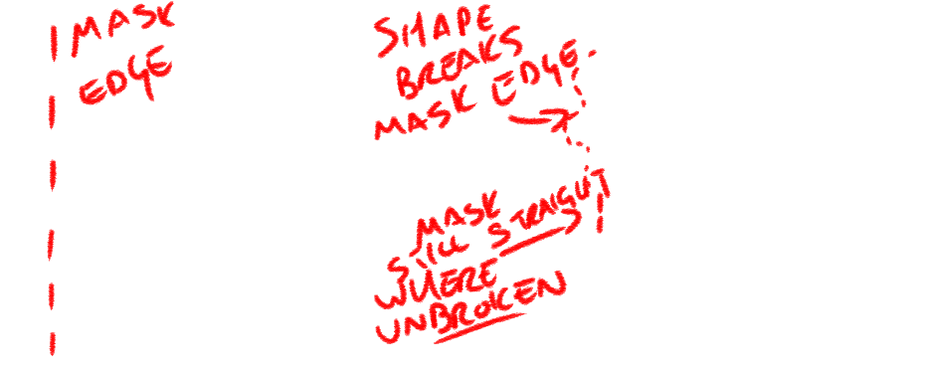
In working with the masks and effects on After Effects I've had an idea for a way to employ the techniques in my film. Personally I'm not a fan of using non-conventional cuts, especially masking and cropping. I find that they look manufactured and, for lack of a better word, silly.
However, I can use masking and transforming effects to select and isolate elements in the shot and distort them. I can use this to make set elements and characters in the shot look crooked. I can distort the cat, the Crooked Man, the stile, the house - everything. The possibilities for where I can apply this are just about endless, and if I use to its potential it can really help magnify the odd and unsettling effect I'm hoping for.
Planning the shoot.
As I begin planning all the elements of the shoot I've been struck by just how inconvenient working with a cat will be. I have a cat and I have a fake mouse, but not only is my cat not stage-trained, he's not even well behaved. He is docile, and interacting with him shouldn't be a challenge, but framing a shot and then getting him to remain within it and do exactly what's required of the character poses a challenge.
My best idea at present is, seeing as I'll be filming in my back garden, to employ one of my siblings to operate the camera for me, rather than mounting the camera on a static tripod. This way we can follow the motion of the cat, rather than rely on the cat to follow direction. This will also provide someone off screen who can use treats and visible cues to help direct the attention and movement of the cat.
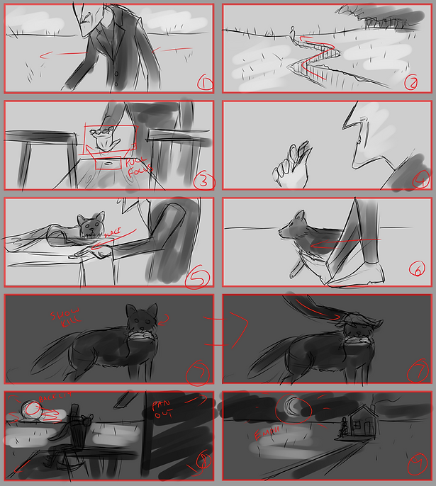
Below are my storyboards for the essential shots I'll be using in There Was a Crooked Man.
Shoot elements.
Set pieces.
- Crooked mile - a long expanse of land with few or no modern details.
- Crooked stile - any small wooden bench or structure will do; the shot is a close-up.
- Crooked house - small and worn, will be obscured.
Props.
- Crooked sixpence - I think I have a genuine sixpence somewhere, but if push comes to shove I can just bend a 10p coin.
- Dead mouse - I have a life-sized mouse finger puppet; will not be shot close-up, so can be inaccurate or unrealistic.
- Top hat - for establishing time period.
Atmosphere.
- The main sources of light (the sun, the sunset, and the moon) will all have to be superimposed.
- Chimney smoke and distant fog/dirt clouds will also be superimposed. In the final film the majority of the sky and background will be artificial or heavily altered.
- Lighting should be warm tones; almost sepia-toned.
Characters.
- The Crooked Man - played by me; I'm shooting at home, where I'm the only person right to perform the role. Wardrobe should be a long, thinning coat, a top hat, and formal shoes. The shape of my body and my movements will be altered in post-production.
- The Crooked Cat - played by my family cat, Scruffle. Scruffle is tame, but impatient and not trained in any way. He responds well to food, but not well to being made to do things, so tasks such as holding the dead mouse, and remaining still on the shop counter and rocking chair may prove challenging to film.
I think the best course of action for working with Scruffle is to employ the assistance of both of my siblings, and have one operate the camera while the other helps subdue Scruffle from out of the shot, both by the use of visual cues, food incentives, and ensuring that he remains present and in-position between takes. It occurred to me that the stand-in for my dead mouse is a finger puppet, and as such has a small reservoir inside for the finger to use. My plan is to fill this reservoir with treats or catnip, which hopefully should encourage Scruffle to hold the mouse, and perhaps even play with it, which is an agreeable alternative and could potentially help with the creepiness and uncomfortable atmosphere of the film.
Immediately during the shoot I was confronted by the fact that both of my siblings have worryingly shaky hands. Every shot I have is very unstable and shaky to the point that my face is visible on several occasions, and I had to run them all through Premiere Pro in order to stretch and animate the shots so that my face remains concealed. I considered stabilising the shots, but ultimately the shakiness added to the atmosphere, and I do generally prefer handheld shots to stable ones (within reason - I would never intentionally make a film this shaky). I have, on several occasions, added a subtle shake effect to still shots in order to make them look handheld.


The first step, once all my footage was imported and cut together on an After Effects timeline, was to mask out the sky in every shot. The sky actually ended up looking very similar on the shoot day to how I wanted it in the film, but in the interest of both fulfilling the requirement to use masking in the project, and making the film more surreal, I opted to replace the sky anyway.
Once I had cut out all of the sky, and in one or two shots I also cut out areas of the landscape that were unsightly or inaccurate, I had to find something to replace them with. I didn't want to use either public or copyrighted footage, so I decided to try something a little bit unorthodox and compose the backgrounds using the footage.
To do this I replicated the original footage - without the sky masked out - on the layer below and applied a distortion effect to it so that it wasn't recognisable as the same shot, but would still have the same shakiness and camera motion. Then I heavily blurred the layer, adding more texture with noise and grain effects, which led me to the shot pictured below


From there, I isolated an area in the shot using a circular mask and applied brightness, glow, and blur effects to it until it looked like the sun. I also added a horizontal 'sine wave warp', which gave it a wriggly animated distortion effect like heat refraction one sees during a sunset. All of this culminated in the shot pictured below, which is taken from the final video, and therefore has also been subject to grain, a film overlay, and some subtle distortion.
For the front-on shot of the crooked house I used a very similar process, colouring the sky blue rather than orange, and adding a second circular mask to the moon itself to cut out a portion and give it a slender crescent shape.
For the field in which the crooked house is situated I gathered some footage of a large expanse of wheat and carefully positioned it in the lower third of the frame. I also overlaid a photograph of the stars atop the sky, masking a circle out of it where the stars are obscured by the moon. However, the shots of the wheat and the stars were both taken using s tripod, whereas my footage of the crooked house was terribly shaky. To resolve this I imported the project to Premiere Pro and used the 'nest' function to connect the stars and wheat to the shot of the crooked house, setting them to replicate its position and rotation. This meant that the steady stock shots tracked and replicated the handheld movements of my shot, so that now they fit perfectly and it all looked to be one.
My final addition to every shot in the post-production process was a lot of noise, but I also added some random, subtle waves to the footage, so that everything in the shot was slightly warped and jagged, giving it all the 'crooked' look. It's very noticeable in the porch of the crooked house, and the face of the Crooked Man, and I'm really happy with how it affected the film as a whole.


For the sky in the rest of the shots I used a similar process as previously, replicating the original footage and blurring it, but with these shots I wanted the sky to look like drab clouds. I achieved this by only blurring the footage horizontally and lowering the saturation to a subtle grey-green. I also gave the rest of the footage a similar hue to make the atmosphere consistent.
For most of these earlier shots I not only added the crooked warp effect, I also stretched them vertically to make the Crooked Man appear taller and slightly more lean.
Once all the filters, grains, and colour grading were applied I altered the exposure and contrast in the 'Lumetri colour' window to make the light and darkness of the film seem more washed out, replicating old footage shot on film. I also rendered the film in lower quality, and a very low frame-rate of just 15fps in order to make it not only seem older, but also make the Crooked Man's movements seem more shaky and jolted.
While researching the poem I was reminded that a very horrific and stylised stop-motion version of the Crooked Man character appeared in James Wan's The Conjuring 2. This gave me a conveniently appropriate rendition of the nursery rhyme to use as a soundtrack for my film. I opted not to feature the lyrics, instead simply using the isolated music-box audio. The tone of the music fits the tone of the film nigh-on perfectly, and has the added benefit of being the well-known tune of the poem itself. I also added a sound effect of a vinyl record crackling in the background, both to add a bit of ambient noise, and to consist with the aged appearance of the film.

I'm about as happy with the result as I expected to be. There are several things I would do differently, namely my choice of camera operator, and perhaps even choice of set. I find myself unable to determine my feelings about the very stylised, almost cartoonish skies. I do like how they look, but I feel that they wouldn't seem so out of place if I had applied elements like that to other parts of the film than just the two climactic shots.
I also find myself rather annoyed by the fact that the framing of several shots was thrown off simply because of my cat's lack of co-operation, but I anticipated that. I find that the style of movement I employed as the Crooked Man combined with the aged look of the film and the low frame-rate are all somewhat reminiscent of 1920's silent movies like The Man Who Laughs and Nosferatu, the former of which I'm a huge fan, and the latter I greatly enjoy. In honesty, that wasn't my intention in terms of the visual style, but it works, and I'm pleasantly surprised.