UNIT IX.
Analysing music videos.
In looking at several music videos I noticed two trends in the way that they're made and styled visually. Some music videos show the artist performing the song, sometimes very simply, and sometimes in a detailed set or environment. Other videos show a narrative, whether related to the lyrics or not, that tonally matches the genre of the song. The former style always features the singer or band responsible for the music, while the latter varies. Often times in the latter the artist is featured momentarily or in brief cutaways, while the narrative goes on featuring other performers.
I began by looking at two different videos by the rapper 'Childish Gambino', a persona of actor and musician Donald Glover.
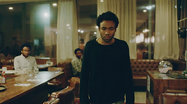
The first video, pictured right, is Gambino's Freaks and Geeks, which is composed entirely of one long take, a simple straight-on shot of an empty wall that gradually zooms in.
The shot zooms in perfectly straight, with no variation in angle or perspective - save, of course, for very minute movements due to the shot being handheld. Despite the shot zooming in on a single point through the video while Gambino runs and jumps around the set, by the time the shot reaches its conclusion Gambino has perfectly aligned himself in the centre of the frame, and the take comes to an end on a close-up of Gambino's face.
Very little happens in the video besides Gambino's energetic dancing, but the lighting of the shot and the setting of the video do a lot to represent the tone of the song. The song is upbeat and fast-paced, par for the course for 2011 hip-hop, but the key of the music and the lyrical content help bring the song in-line with the setting for the music video, as does Gambino's vocal performance, as the song explores mature themes and the consequence of Gambino's fame.


The second of Gambino's videos that I looked at was Sweatpants. Once again, the video is only one shot, but this time it's only made to look as such, with subtle camera tricks used to mask the fact that the video would actually have been achieved in multiple takes.
The video begins with Gambino entering a restaurant and sitting down for a glass of water with some friends. He stands and begins to walk around the restaurant, playing a song on the jukebox and eventually stepping outside, where he checks his phone. Outside he sees a couple kissing and a man vomiting into a potted plant.
Gambino returns to the restaurant in an almost identical fashion to the first time, but when he sits down all of his friends at the table are identical to him. He stands and makes his way outside again, where he sees that the vomiting man and both members of the kissing couple are also identical to him.
Upon his next return to the restaurant every character is identical to him. Gambino becomes disconcerted and begins uncomfortably making his way out again.
Contrasted with Freaks and Geeks, this video has a lot more complexity, and a lot more meaning. The lyrics of the song speak to Gambino's success and wealth, and Gambino expresses a lot of superiority and vanity. Put into context, this makes the video seem as though it could be about one or both of two things; Gambino's self-obsession and absorption, and how it's affecting his world and his perspective, or it could be about how overwhelmed Gambino feels by his fame and success, seeing his face everywhere and having everybody's attention and admiration upon him.
These videos are two very different ways of making a music video which features the artist's performance as the real subject of the film, regardless of how much meaning or creativity is present in the background. The lyrics and the musician are the star, and they are emphasised at the forefront of the piece, which any activity in the background is used to aid in portraying the message of the lyrics and the tone of the music, rather than telling their own unique story.
Next are two videos which use the opposite formula; the video tells its own narrative.
First I looked at On Melancholy Hill
by Gorillaz. The difference between Gorillaz and many other music videos that tell a story is that the videos for Gorillaz songs, more often than not, are direct visualisations of the story told by the song's lyrics, one of the best examples being Fire Coming Out of the Monkey's Head.
On Melancholy Hill isn't much different, as the music video, while having no diegetic music and not technically featuring the performers (their animated personas are the characters of their videos) tells a cinematic story that correlates very closely to the lyrics. I'd consider the Gorillaz' style - animated or not - to be the other side of the coin to the video for Sweatpants. Sweatpants and On Melancholy Hill serve as sort of transitionary stages between the performance style of music video and the narrative style of music video. SweatpantsI still focuses on the performance, but has relevant narrative aspects present in its setting and background, while the video for On Melancholy Hill focuses on the story, and the music serves as a sort of narration.


Next I examined the video for Radioactive by Imagine Dragons.
What I find interesting about this video is that it features both the elements of a narrative unrelated to the lyrics and the performance of the artists. The two elements are kept separate, with the different scenes being intercut so that Imagine Dragons are briefly visible before the video cuts back to the narrative, which is given more screen-time. The two aspects are also kept separate tonally. While both are quite dark, there are comedic elements in the narrative that aren't present in the shots of the band, and the narrative is comprised exclusively of warm tones, while the shots of Imagine Dragons are all tinted a cool blue. There is a brief introduction to the narrative before the music commences which is shot outdoors in cool tones and sombre weather, but it's more greyscale than blue, and the constant presence of Alexandra Daddario's character in the narrative as well as the very linear nature of the way its shot ensures that the opening sequence is attributed to the narrative.
At the end of the video, the narrative ties-in with the sequences of Imagine Dragons, as Daddario's character enters a dungeon below the puppet-fighting ring and frees the band from a cage with a key that was around the neck of the tournament owner throughout the video.
Prior to this conclusion, the shots featuring Imagine Dragons were connected to the narrative with more subtle hints, such as the presence of destroyed puppets in the backgrounds of shots, and a couple of puppets being dumped through a chute into the dungeon.
I've no doubt that I'm going to follow the second method and make a piece that focuses on the visual and tells its own story. s much as I do appreciate music videos and admire the skill that goes into a great many of them and the result that comes from it, I'm personally not particularly fond of making them myself, so I'm using this as an opportunity to make a short film that requires no dialogue, which is something I'm fond of doing.
I'm also not particularly attracted to the idea of attempting to replicate the performance of the artist of whatever song I choose because, while I would use the original audio rather than make a cover, I would need people to play the artist or artists, and very few of my classmates feel comfortable giving a truly emotive performance on camera - which is essential to portraying a musician or any artist - and replicating the performance is simply something that's of little interest to me anyway.
Conventions in music videos.
The music video for All Goes Wrong by Chase & Status and Tom Grennan uses several good framing techniques in its first scene that help the shots fit the rule of thirds well.
In the two shots pictured right the environment in the scene is used to frame the subjects and the action, with the character in the coffin being framed by the edges of his grave. The darkness of the dirt and his suit help the pale base of the coffin and his face and shirt to catch the eye, as well as them being centred.
In the second, the action is framed both by the environment and the lighting. The trees in the two outermost thirds of the shot are much darker and more heavily contrasted than the trees in the far background of the central third. This makes the trees on the outside frame the action in the centre of the frame.


In the first shot pictured left the characters break up the shot into its thirds, with the focal preacher in the foreground both drawing the eye by being in-focus and by featuring the most brightness in the shot, while the mourning relatives in the background are also emphasised, one by being central in the frame, and the other by aligning with the division of the right-most third.
In this next shot, the viewer's eye is drawn to the face of the angel statue by the direction of the statue's wings and its raised arm. The curvature of the wings serve as both a leading line and a framing device. The inner arches of the wings frame the face of the stature by creating a border of the dark background around the statue's head, while the angle of the top edge of the wings leads the viewer's gaze to the angel's face.
In this third shot the only action visible whatsoever is the mourning woman, who we later learn is integral to the plot of the music video. She is framed by the edges of two other character's jackets, both of whom are well in the foreground and out of focus, creating two masses of dark negative space either side of the woman, naturally drawing the viewer's eye to the colourful and detailed subject of the shot.
The music video for the song Human Behaviour by Bjork features both on-location footage and scenes shot on several sets.
Something I find interesting about it is that, despite their presence on-set or on-location in some shots, the same characters will be green-screened into those same locations or shots at another point in the video. For example, in the shot pictured right we see a 'bear' approaching a man in the woods. The shot pictured below is later in the video and in the same woods, but in it the bear was obviously shot on a green-screen and chroma-keyed into a shot of the forest.
The thing that interests me about this shot is that it would have been easily achievable on location; it's just a very brief tracking shot of the bear running, but in the green-screened version the bear was clearly running on the spot, and the speed of the bear's steps is much slower than the speed at which the forest shot moves.
It's intriguing to wonder if this is simply a result of poor execution, as it's a fairly common error made throughout film in similar shots, or if it was done deliberately, as it would fit the strange and surreal style of both the visuals and Bjork's music.


The video as whole only features two real people, one of whom being Bjork, and the other being a hunter who is only present very briefly. There is also a shot of several people wrapped up in blankets squirming around in a giant bird's nest, but they only appear for that shot.
The rest of the video, including the bird's nest, is largely false. Some shots are recorded on-location in a real forest, but the forest as a setting within the video is made up of the real forest and of shots of artificial plants and a model forest. Aside from a couple of props with which Bjork interacts, everything else in the video is either fake or altered, and though I presented a great many exceptions previously in this paragraph, the amount of those fake or altered elements in the video is much larger.
A lot of the settings in the video look as if they are actually very small, but shot in close-up to appear regular, and then Bjork was superimposed into those shots using a green-screen. For example, in the top shot pictured left is a cabin, which is obviously just a small model cabin, and it appears to have been made with matchsticks and twigs. In the shot directly left, the background is also not part of the same shot as Bjork in the foreground. In some transition shots it's made evident that she's been superimposed onto that background.
The final shot pictured left makes it even more obvious that Bjork is edited in, as the shot is a close-up of a real lightbulb, and Bjork has been put into the frame at about the same size of the bulb. Given that throughout the majority of the video Bjork's size is proportionally human - relative to the bear, the house, the trees, etc. - I'm unsure as to whether this shot is supposed to imply that Bjork is suddenly much smaller, or that she has a giant lightbulb in her cabin and that the moth is enormous. The moth is achieved using stop-motion, and in the bottom shot is really present on the bulb, but this sizing is inconsistent with its sizing in previous shots, for example the one I pictured above that of the light bulb. To me, this makes it seem like the moth's inconsistent sizing was an error, and the size of the lightbulb is just a result of an idea had by the director or Bjork, with little thought put into its consistency.
Beyond using chroma-keying, Human Behaviour also uses masks and superimposed footage. In my opinion, it's not used particularly effortfully, but it is used effectively.
One way it's put to use is to represent the imagination of Bjork's character (who I assume is just Bjork), appearing as a small circle and expanding to fill the frame before settling for a while as pictured in the shot to the right. The animation of the expansion and the warping edges isn't particularly smooth or consistent. I think that the jagged animation of the warping edges of the circle was intentional, as it fits with the video's style, but the inconsistent animation of the mask's expansion doesn't seem intentional, especially with knowledge of hoe masks are animated in Premiere and After Effects. The poor animation is a common problem in Adobe program masks.
As pictured right, the masking is also used for some more uncommon purposes, in this case giving the audience a view into the stomach of the bear, within which sits Bjork. I'm not particularly fond of this use either, the shape of the mask doesn't fit the bear very well, the feathering around the edge is poorly executed and gives the impression that the masked footage has a shadow, which makes it look closer to the foreground than the bear, rather than looking like a view inside the bear. The animation of the mask following the movement of the bear is also poorly done, as the footage moves at different speeds and consistencies than the bear does.
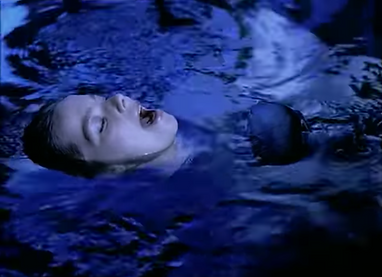
In this final shot, the reflection of a false sky has been imposed over the water in which Bjork is swimming, and the reflection has been masked around her face and chest to make it look part of the water. The reflection effect is very well executed. It obviously has a very simple warp effect over it that doesn't perfectly match the motion of the water, but it does look like a reflection the colours are very nice and well saturated, and the mask is a lot crisper and smoother than the previous attempts.


I don't think there's any doubt that I'm most inspired by and attracted to the more cinematic and independent music videos than those that portray the narrative of the song's lyrics. With that being said, I am hugely fond of Childish Gambino's Sweatpants video; the surreal style is very engaging to watch and very meaningful when context is taken into account, and it would undoubtedly be great fun to do something similar.
Admittedly, my decision to lean so heavily into the cinematic style and throw any consideration of including lip-syncing or the implication of a diegetic performance out of the window is purely self-serving. I'm much more enticed by the idea of producing a video that I'm interested in that's related to the song mostly only in tone, and then timing it to the music.
There are plenty of interesting conventions in the Bjork and Chase & Status videos, but I find that the latter, the video for All Goes Wrong, is only particularly artfully composed and shot in its brief opening sequence, and once the funeral scene passes the rest of the video is fairly simple. The shots are all very cookie-cutter, serving only to frame the singing character centrally rather than focusing on anything cinematic or eye-catching, and the colour composition becomes significantly less attractive than that in the funeral scene, with very washed out colours and very little contrast. I do like the shots in the funeral scene that use the environment as framing devices, for example the shot that has the sides of two characters close in the foreground framing the crying woman in the background.
I'm actually not particularly fond of the Human Behaviour video, which is interesting because its techniques and special-FX applications are comparable in a lot of ways to many of the techniques I used in my adaptation of Alfred Noyes' the Highwayman in the previous year of the course. Taking that into account, I think that there are some aspects of the production for the Human Behaviour video that I'll likely draw technical inspiration from, and that will inform some of the effects and digital compositions used in my video.
My ideas.
In searching through my music library I came across six songs that I felt would be good tracks to which I could set a narrative video. I chose the songs by listening through my library and seeing if I was immediately inspired by any song and could come up with an idea on the spot which fit the tone and could be timed to the music. For six of my songs I was able to instantly visualise a story I could tell. The six in question are:
- Penny Nickel Dime by Amp Live, Anya, and Prof.
- Mr Blue Sky by Electric Light Orchestra.
- The War by SYML.
- Bond by Brock Berrigan.
- Kicks by Barns Courtney.
- Everybody Knows by Sigrid.
Penny Nickel Dime.
Amp Live (feat. Anya & Prof.)
My idea for Penny Nickel Dime is to feature a day in the life of criminals in several different walks and calibers of crime.
The video would feature stylish, noir-type sections that tell the story of a wealthy career criminal running a dominant, city-wide mafia.
There would be sections shot like a high-octane pop-music video, featuring bright neon lighting and loud music, telling of a criminal who runs classless underground endeavours like night-clubs that double as brothels.
I would also feature a more middle-class, less business-oriented criminal or criminals, like bank robbers and burglars.
Finally would be the very low-class, direct, and hostile criminals. Ragged, poor felons; muggers and drug dealers, working on corners with cheap weapons and making very little money.
Mr Blue Sky.
Electric Light Orchestra.
For Mr Blue Sky I came up with an idea which would be very special-effects heavy, and would also require a significant cast; two downsides right out of the gate.
The idea is that the video opens on a brutal war-zone, clearly a battle that's been waged for years and years. As the sun begins to rise over the horizon and travel across the sky, everything its light touches transforms from a broken and bloodied no-man's-land into a bright, saturated suburb. The soldiers become children, their firearms being replaced by guns, as they playfully shoot one-another with water. The sun continues across the sky, and its light stretches to cover the landscape, little by little replacing guns with toys, soldiers with kids, and bullets and ammo shells with water.
When the song begins to reach its conclusion the sun sets, and as the light disappears the land gradually begins to return to the battered war-zone, and the kids return to being bloodied and injured soldiers, saluting the sun as it disappears before charging back into war.
The War.
SYML.
My original idea for the War was the story of an immortal being who lives throughout all of time and is forced to watch his friends, family, and all of humanity die around him as he is left alone on a dying planet, and eventually in an empty universe. As I listened to the song more and more, trying to better visualise my idea, I changed my premise to one of a god who creates the Earth itself, creates humans, and is then forced to watch as humanity goes from building, co-operating, and thriving, and descends into war, chaos, anarchy, and eventually their hostility and violence leads to their demise, and the god is left alone on his empty world, his greatest creations a failure, forced to walk among the graves of all the beings he lovingly created, and the ruins of all that they built.
Bond.
Brock Berrigan.
Bond is a little different from my other choices because, aside from a brief line at the inception of the song, there are no lyrics and no vocals throughout the duration.
My idea for Bond is relatively simple; a stylish rendition of an opening title or promotional piece one might see advertising an old spy or secret-agent film, something akin to 007 or Austin Powers.
I like the idea of meshing live-action with 2D footage, but not necessarily animated 2D footage. My idea is to record live-action footage and then adjust the contrast and posterisation in post-production so as to make them appear 2D. The video would essentially be montage or myriad of transitions between both live-action and 2D spy-like characters performing feats and poses one might see in films related to the genre.
Kicks.
Barns Courtney.
My idea for Kick is one I'm very fond of, but my concern is that it features a child character and would require a lot of green-screen work. The only green-screen I have access to is in the college, and not only would it be difficult, and perhaps impossible, to get a child in here, but it's also terribly difficult working with child actors, particularly since none of my younger siblings or their friend can act.
The idea centres around a gang of survivors in a post-apocalyptic wasteland. My vision for the wasteland is something akin to Mad Max, or the run-down robot fighting arena in Real Steel. The gang travels through the wasteland, looting and pillaging the other less fortunate survivors, and while they're raiding a decrepit convenience store they come across a young girl whose parents didn't survive. They take her under their wing and teach her their ways of looting, and reveling in destruction and violence.
Everybody Knows.
Sigrid.
Probably my least favourite of the ideas was one which was actually inspired by an episode of Red Dwarf titled Psirens, which features shape changing aliens that wipe out crews of starships by shape-shifting to resemble their greatest desires, and then sucking out their brain. I haven't chosen to incorporate the alien aspect directly, but rather to imply it, and instead my piece is inspired by the scene that the characters in Red Dwarf see on a ship that fell prey to the Psirens.
My idea focuses on an interplanetary mission that has been away from Earth for some time returning to the planet. The people welcome the rocket home with celebrations and cheers, but when the open the doors and enter the ship they find that much of the crew has been violently killed, and those who remain have been driven out of their minds by something unknown, and become erratic and hostile. They are locked away, and all record of them and the mission is concealed by the government, but the people demand to be told the truth, and anyone who uncovers it is taken and locked away with the crew-members.
Before moving any further I've decided to narrow it down to my favourites of the six ideas. After some careful deliberation, my choices with which to move forward are Penny Nickel Dime, the War, Bond, and Kicks.
Mind maps.
Penny Nickel Dime, Amp Live.
Story.
- My story for Penny Nickel Dime doesn't have to be strictly linear, but in saying that I've had the idea to perhaps only feature one character, and rather than show multiple criminals in multiple walks of life to instead show one criminal gradually climbing the ladder from street mugger to mob boss.
Tone.
- Despite wanting to remain tonally consistent in portraying every version of criminality that the character of characters go through as weary and dark, I'd also like to take the opportunity to experiment with different styles, as each different phase of the criminal ladder that I'll be portraying can lend itself to one of the many styles in which music videos are generally shot.
In the low-tier, street-level crime there's the gritty, sickly-toned style of music video used in lots of rap and grime music videos. In the next tier, bank robbery, is a more clinical but still highly contrasted appearance, with very little colour but lots of dichotomy between light and dark. For the night-club scenes I can use the bright lights and saturated blues and pinks of your typical high-octane pop song music video. For the top tier, the organised crime, I'd actually like to stray away from typical music video conventions and instead use it as an opportunity to experiment with the old 1940's and 50's noir style; washed out colours, barely saturated enough to be sepia tone, with dark, gritty urban areas broken up by the harsh lights and heavily contrasted wardrobe.
Setting.
- The setting of the scenes vary, but one thing that doesn't is the ever-present emphasis I'd like to put on the fact that no matter how high the criminal or criminals progress, they are never in good conditions. The streets at the beginning of the film need to be cold, dark, and gritty, and so too does the expensive and gothic architecture that is the domain of the mafia don at the end of the film. What I'd like to always keep present is the idea that no matter how far they progress and how much money they make, they are still never any happier, and they are still forced to live alone in the shadows.
Another idea I've had to help with this is for the criminal, if I go with the idea to feature only one character, keeping the same gun throughout the entire film. His clothes will become nicer, his grooming and home will too, but at the end of the film he still has the same gun. I'd like to do this so as to represent that he's never really progressing, it's just an illusion, and just as his gun will eventually run out of bullets, he will eventually run out of luck.
Characters.
- Again, I'm yet to make up my mind as to whether I'm using multiple criminals in different walks of life, or one single criminal progressing through the ladder of crime. I'm definitely leaning more on the side of the latter, not least because I love performing just as much as I love filming, but also because featuring other actors has, in the past of my own work at least, proved inconvenient both to their timetables and mine.
The War, SYML.
Story.
- The premise of my idea for the War is a narrative video following a god who finds himself on a new world of his creation and gradually builds it into planet Earth.
Everything is going well, his creations are thriving, and humans are building vast civilisations and monuments. But people gradually begin crafting weapons and turning to war and violence, and the god has to watch as all of his creations destroy themselves and his planet around him and he is left alone in an empty world.
Tone.
- The video needs to undergo a vast tonal shift about halfway through. The video should begin hopeful and bright, gradually getting more and more heartwarming as the god swells with pride at everything his creations are building. But then everything needs to become drastically darker and more tragic, as the people turn to more and more violent and destructive methods of warfare and devastation.
Setting.
- The setting needs to vary as the world is built and changes. My vision for the opening is a world which is a pure white scape of nothingness; a blank canvas. The god will add a sun water, land, and gradually the greenery and colourful plant and animal life will be created. This entire opening needs to have a warm and highly saturated appearance.
As humans begin to take dominion over the planet, building their vast monuments and structures, the tone needs to become more golden and extravagant. I want the viewer, as the god does, to bask in the wonder of the complexity and creativity of the human's creations. Very subtly, as the sequences progresses, it will become less and less saturated. For example, the sequence will begin with the building of things like the pyramids and the Taj Mahal, but end with things like the Eiffel Tower and the Empire State Building; still incredible, but more grey and harsh.
Once the god catches wind of all the violence and murder, the tone must become immediately grey and drab, like an old war movie, as the world indeed descends into war. I'd like to show the American Civil war so as to portray the god's heartbreak at the idea that his creations would fight so hard to keep something as horrific as slavery, and I'll show both World Wars, as they're arguably the most famous and devastating. Even throughout these spectacles, the focus must remain on the god and his reactions. I'll end with a nuclear war; humanity completely devastating itself and sealing their end in the most frightening and destructive way possible.
Characters.
- The story only really focuses on the single character of the god, and any presence of people is established and focused on more through the presence of their buildings and influence on the world, rather than the physical presence of any specific people. However, I will still need to show some characters. For the most part the humans will be both figuratively and literally out of focus, which means I can play them myself and then blur myself out in post-production, making myself unrecognisable and thereby distinguished from the god character, who will inevitably be played by me.
One occasion in which I will definitely need to feature a second actor is during the Civil War scene, which will need to feature a confederate soldier as an antagonistic character. For the shots focusing on other wars I can use real footage of soldiers and battles from the time, but video cameras didn't exist in any useful form at the time of the Civil War, so I'll need to come up with my own footage for that.
Bond, Brock Berrigan.
Premise.
- The basic premise is one which has been explored a lot before, as it doesn't tell any particular story or narrative, but rather serves to establish a style and tone. It's used a lot in title sequences or intros, the examples that come to mind are FX's Archer and Spielberg's the Adventures of Tintin, which helped inspire the idea somewhat, as I examined the movie during he induction project.
Tone.
- Tonally I'd like to lean on the sleek and stylish side. I think minimalist 2D animation, especially if I limit it to two tones, likely black and white, lends itself a lot to the style of older James Bond movies. I could, and likely would, also incorporate one or two other vibrant colours, but I'm undecided as to whether I'd include a red or gold to try and keep it tonally like 007, or perhaps some more garish colours like green and magenta, which could bring it in line with a more cheesy spy production like Archer or Austin Powers. I think a good balance between the two would be best; a great example of a film that's stylish and classy, but still fun and cheesy at the same time, is Guy Ritchie's the Man from U.N.C.L.E., and I'm drawing a lot of inspiration for the tone from that.
Visuals.
- I've got several ideas for the visuals. If I choose this idea I'm dead-set on featuring a recreation of the iconic shot of James Bond through a gun barrel aiming at the viewer. Beyond that, most of my inspiration is coming from the Archer intro. I like the clean, 2D visuals, and I like the way it transitions from credit to credit by following a white ball that substitutes for several things throughout the video, starting out as a bullet, becoming a pearl necklace, a wi-fi symbol, a ping-pong ball, and eventually the head of the Archer character himself.
I'd like the video to be very fluid, never requiring dissolves or jump cuts, as every animation should meld into the next, whether it be through camera tricks, masking, or taking advantage of the 2D nature to have one object or character to become another. A lot of kaleidoscope-like imagery comes to mind, as I can feature and animate the 2D characters in more non-conventional ways.
Characters.
- I'd like to keep the piece very conventional to the genre. Since characters wont have any lines or arcs, and there's really no story, I'm going to rely on genre tropes and stereotypes to keep the film in line with the tone.
Exclusively featuring tropes like the dashing leading-man spy, the femme fatale, the computer-oriented character, the turtle-neck wearing brutish evil henchman, and the memorably disfigured evil villain will help to make the film feel related to the genre, more like a general piece of representation for that style of movie, rather than a specific entity with its own story and defined characters.
Kicks, Barns Courtney.
Story.
- The story of my idea for Kicks is a much shorter narrative than the ones for Penny Nickel Dime and the War. The story for the former has to span a criminal's entire career, and the story for the latter has to span all of time, but the story for Kick could take place over the space of a day, or even a few hours. This gives me the opportunity to focus more on the character development and the personal relationships rather than having to focus on the beginning middle and end of a narrative, as this idea is more contained and character-driven than the others.
Tone.
- Exploring a post-apocalyptic setting provides a lot of opportunity for experimentation and stylisation, not least because it's a time period that hasn't existed in real life, and therefore can be interpreted in any number of ways.
Despite how desolate I want the landscape to be I never want the film to seem dark or dangerous tonally. I think that in order for the development of the child character to make sense the survivors that take her in need to be the dominant faction in the wasteland, and as such have very little concern or tension. I'd even like the ending to be very heartwarming.
Setting.
- Throughout film and TV the far future has been represented hundreds of different ways, from highly urbanised utopias made up of advanced technology, to barren wastelands made up only of violent and sparse factions of survivors, to unjust dystopias dominated by corruption and class warfare. There are really infinite possibilities as to how it can be portrayed, but films like Blade Runner and its sequel, and Real Steel are examples of the future being divided up into different sections, some of which are wastelands, some of which are utopias, some of which are dystopias.
My choice will come down to determining exactly how long of a timespan my video will cover.
Characters.
- None of the characters will be named or have any dialogue, and the majority of the group really serve only to further the development of the child character, so they don't need to delved into with any particular depth. If I had money and time I'd look for more ways to include character details and development in the wardrobe and appearance of the characters; features on their clothes or weathering on their skin that could imply things that might have happened to them in the past. As it is, I don't have the budget for detailed costumes, so they'll probably be left relatively simple.
- My inspiration for the appearance of the survivors comes largely from the 'Mutant Gang', a group of criminals featured in Frank Miller's graphic novel Batman: the Dark Knight Returns. They all wear damaged clothes in a punk or biker style, and have some kind of spiked headgear or body modification.
- The child needs to end the video having been developed into one of the gang, with a similar wardrobe and make-up. At the beginning, however, she should be dressed like a regular child to the modern day, to give the impression that she was coddled too much by her recently deceased parents, and that she was always kept safe and sheltered from the reality of the world around her.
The decision comes down to Bond and the War, as these are the two options that I'm most enthusiastic about and that are most feasible.
Exploring Bond.
As previously stated, my idea for Bond relies entirely on the visual, and has no story or meaning of its own. Seeing as how it relies entirely on the song rather than it's own narrative, the most important aspect of making the video work is to narrow down the tone and style that would best suit the music. This comes down to making a choice between a darker, noir-style tone, a cheesy 70's spy parody, or a sleek and stylish secret-agent theme. The tones with which I would approach each of these choices are best represented by the images below respectively.


Save for the Austin Powers poster, which uses unaltered live shots of actors, the posters above also give an indication as to the way I would edit the footage to look, and what I mean by '2D characters'. My plan is to begin with live footage of actors in costume on a green screen, and then to contrast and posterise the footage in After Effects, so as to make them look 2-dimensional and minimalist.
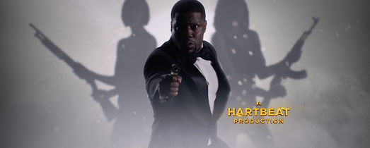


The cinematic intro for Kevin Hart's comedy special What Now? opens with a montage of graphics and visuals including those pictured left.
While this sequence features un-flattened 3D footage of actors, something which I'm not going to use, it does also feature the 2D silhouette style more akin to my intentions for some of the background characters, or at the very least a close approximation achieved by vastly reducing the contrast on the footage of the actor.
While this sequence is largely 3-dimensional and very CGI-heavy, the style of the presentation and the animation does a good job of representing one of the ways in which I envision my music video for Bond.
The transitions from shot to shot seldom use jump cuts, and instead focus on dynamic single-take style transitions. For example, the shot pictured directly left continues with the the silhouetted woman firing her gun. The camera pans following the bullet as it penetrates a series of floating playing cards with Hart's face on them, and then morphs into the golden muscle car, pictured left, and lands on the edge of a collapsed bridge. While this is obviously achieved through the use of CGI, it's a good example of the way that I would like to feature fluid and dynamic transitions from shot to shot or subject to subject, rather than using pre-built transition effects or sharp cuts.
I also really like the use of colour in the sequence, or the lack thereof. The use of the different grey tones to represent smoke and being underwater add a lot of atmosphere to the sequence, and the contrast of very deep black values and crisp whites help with the clean and sophisticated style of the spy genre. But what I like most is the inclusion of gold as the only colour in the sequence, which really helps to set certain subjects apart and make everything look that much more stylish. I would likely not use gold myself, but I am drawn to the idea of using this method and having a single colour juxtaposed with greyscale in my own piece.
A part of the inspiration for this video came from examining Steven Spielberg's the Adventures of Tintin during the induction project. The opening credits and titles of the film feature a mostly 2D sequence that's a brief adaptation of some arcs from Herge's original comic books.
Like the rest of the film, the sequence was created using motion-capture animation, which I feel makes it the most similar from a production standpoint to how I will create my video. I won't be using motion-capture, strictly speaking, as the technology is unavailable to me, but I will be using live-action footage and then flat-rendering it, and this sequence from Tintin features flat-rendered silhouettes of the mo-cap character models.
Unlike my plan, this sequence does follow a linear, self-contained story, but it also features dynamic transitions, and thanks to the capabilities of motion-capture it has a lot of room to use the transitions creatively. The shot pictured right of the titular Tintin falling through a spiral follows directly from a shot of Tintin being hit over the head with a club. When he's struck, the shoot zooms in close to him and he topples over and begins falling through the ground as it turns into the spiral. The entire sequences holds the illusion of being achieved in one take and, while I find it unlikely, it would have been achievable, as motion capture sets have no determined background, and are simply shot on a soundstage, often with wire-mesh set pieces.


One of the most accurate representations for how I'd like my video to look is the title sequence for FX's Archer.
Archer is an animated series that follows the exploits of the self-defined 'world's greatest secret agent', Sterling Archer a.k.a. 'Duchess'. The intro sequence for Archer represents a good balance between my two previous examples, Tintin and What Now?, as it relies on a montage rather than a narrative, but is 2D animated.
With that being said, unlike the other two this sequence is animated from scratch, with 2D character rigs being used for both the title sequence and the show as a whole. Despite using 2D animation rather than flat-rendered live action footage, everything else about the Archer title sequence is a better representation of how I envision my own video.
In many ways, the sequence is similar to that of What Now?, as it features silhouettes in more specific and defined poses, rather than moving around freely and naturally like in the Tintin sequence. And, similarly to the bullet transitioning to the car in the What Now? sequence, the Archer intro features a tittle (the dot atop an 'i' or 'j') as a constant subject tying every shot together. The tittle begins atop the 'J' in the name of lead actor H. Jon Benjamin, and the silhouette of his character, the titular Archer, enters the frame and fires his gun at the tittle, launching it away. The 'camera', for want of a better term, follows the tittle, leaving Benjamin's credit behind and moving onto the next one, that of actress Judy Greer, where it occupies the centre of a pearl necklace around Greer's character's neck.
Through various different interactions and obstacles, the tittle is moved around and followed in the frame, displaying the credits for the main voice actors, before it falls, landing on the headless body of Archer's silhouette, and becoming his head, bringing the title sequence to a close.
This 'single-shot' method is one which I'm very fond of and intend to use, though perhaps in some more abstract ways.
Archer has the added benefit of having also explored the noir genre in its 8th season, meaning it's fulfilled my trifecta of stylish, cheesy, and noir, giving me inspiration to draw from for whichever of the tones I choose to use.
At the climax of the 7th season, the titular Archer is shot and drowned, and falls into a coma. The 8th season picks up inside his comatose dream, which revolves around a private investigator in Los Angeles just after the second World War. This season, entitled Archer: Dreamland, brings with it a new intro, animated in much the same way as the original, but with the noticeable tonal shift to match the new noir style of the show.
This helps to serve as an example of how using the noir style would differ from the others. The two most notable differences are the more muted colours and, more interestingly, the backdrops onto which the silhouettes fall. In the original title sequence the graphics behind the silhouettes of the characters are bold and harsh, all in uniform rectangular shapes. In the noir intro, however, the backdrops are based on are-appropriate architecture. The shapes themselves resemble the windows of war-era buildings, or backdrops used by singers and musicians on-stage in the 40's and 50's. The patterning inside the backdrops in the original sequence is made up of blueprints and designs for modern and advanced technology, while the patterning in the noir intro follows suit with the rest of the design and features patterns seen in war-era upholstery and fashion.
The characters all have different outfits and hairstyles as well, which makes it clear that, despite the generally constant design of the suit throughout history, there are subtleties that will present slightly different costume requirements depending on the genre I choose, and this must be kept in mind.


After listening to Bond more and more and examining the content from related genres above, I think it's clear that neither the song nor the tone I like best is suited to either the spy or noir genres, and the cheesy Austin Powers-like parody genre is off the table.
I'm still undecided as to whether I'd rather do the spy genre or the noir, but the more I think about it the more I think I don't have a preference so much as I'd just like to do both.
Pictured right are a couple of simple designs I made for ways to style the two genres aesthetically, with the stylish spy version pictured right and the noir version below it.
I think it would be very feasible to use both styles, and work around one or the other a little bit to combine them into a single look, or even to use their differences as a way of playing with the contrast between light and dark.
Given that I'm ready to shoot the War now using all of the research and process below, I think it would be more than possible to also shoot some footage, even if not for the entire duration of the song, for Bond, and hold that in reserve to edit as an additional film, should I have time once I've finished the War. I've made up my mind and would like to use the War, but I am enthusiastic about my idea for Bond too, and if I have time to produce it as well I don't see any reason not to.


Exploring the War.
While my plan for Bond relies on 2D rendered footage, making it very simple to shoot but rather complicated to edit, my idea for the War relies entirely on live-action footage, which will make it the opposite; complicated to shoot and easy to edit. Of course, there are a lot of special effects required by the concept, and using 3D photorealistic special effects is more complex than stylised 2D ones, but for the most part it's just a matter of masking photoshopped backgrounds into still shots, whereas the Bond idea will require me to manipulate and animate all of the footage.
There are a lot more things to take into account when shooting footage that will be presented as live-action, as everything the camera picks up will be visible in the shot, and since it won't be erased with the posterise feature like certain details will be in Bond, I have to be careful that everything in the shot is perfect. When shooting live-action, the only things that will be extensively edited are any special effects and any backgrounds that need replacing, and since I'll be shooting using a tripod and adding camera shake in post, the editing will be minimal for the most part, consisting mostly of some simple masking and some colour correction.
I've put some thought into creating the scenes that require the main character to be present during the American Civil War, as it presents a problem the World Wars don't in that there isn't any footage of it that doesn't come from licensed films or reenactments. My idea is to take paintings of the Civil War and separate different elements of them in Photoshop, then to impose the god character into the painting and manipulate the different elements and backgrounds using keying and pinning. Since the god is the subject of every shot, and the setting and characters in the war scenes will be out of focus, I'm not worried that using the paintings will look out of place. Even if it is obvious or visible that the background and other characters will be painted, I don't see this as a bad thing, as it could actually benefit the video by connecting it to modern people's reference of the Civil War.

I mocked up some conceptual storyboards to help visualise my concept, albeit with little detail. The storyboards include some of the first shots that came to my mind when listening to the War.
Something I didn't take into consideration when drawing these frames is that much of the middle of the video will have to feature stock footage or images of the historical events or elaborate environments. The shots set in the Civil War, World War II, the Louvre, and at the base of a pyramid all require either sets, characters, or both that I can only achieve using a greenscreen. Footage or images of all of these environments or events are readily available, so it won't be difficult finding them, but I'll need to carefully pick out my footage before I draw the final storyboards for the video, as the shots will need to be planned around the stock footage, so as to get the angles and lighting right.
I'd also like to designate more screen-time to the positives over the negatives. While the descent into war and violence needs to be incredibly drastic and heavy, I think it needs to be very sudden, both to take the audience by surprise, and because having a lengthy sequence of positivity and glory followed by a very quick and impactful degradation will help to highlight just how severe the corruption is.
To the right are the images, or screen-grabs from footage, that I've found to use in my video.
All of them will require a lot of colour correction to be more consistent visually, so as to be more uniform with the rest of the video. The Civil War picture is too bright and, for want of a better word, majestic, as the US has a history of glorifying their wars for some reason. I'm going to separate the different elements and characters from it to animate them, impose myself in colour, and then reduce the saturation and exposure afterwards.
I've opted to use the Sistine Chapel in place of the Louvre, because it's a lot more ornate. The image of it on the right is perfect to use for a great shot, and is a perfect display of how elaborate and colossal the ceiling of the Chapel is, but I'm going to make the image warmer and ass a lot of effects to the lighting to make it seem almost magical.
I wanted to find footage from World War II that was in colour, but all that I could find were long shots of soldiers, usually marching or rallying. I wanted something a bit closer and more personal to drive home just how deeply the god character is affected by the corruption of his creations.


There's a lot to consider in terms of aesthetics when it comes to making a music video that doesn't need to be taken into consideration for most other formats of film. The issue inherent is that a music video is, in some ways, a sort of afterthought. With every other type of video that I can think of, the film itself is the main article, completely independent of anything else. In a movie, the soundtrack is one of the very last things added in the post-production process. In a music video, the score is crucially composed and performed first. This isn't to say that musicians don't have ideas in mind or concurrent with the writing and composing of a song, but in the production process the video is dependent on the music, whereas in a film the score is dependent on the finished, or at the fully least completely cut-together, composite of the film.
Aesthetically, this is significant to more than just the timing of the video. It means that the tone of the video has to match any changes in the tone or intensity of the song in tandem with it. As an example, the song Mr Blue Sky by Electric Light Orchestra, which I looked at as a potential song for which to create a music video, changes drastically towards the last quarter. About three-and-a-half minutes through the song, the main melody concludes and fades out, and is then replaced by a completely different tune, more operatic and orchestral, even with a different tempo. As such, a music video for this song would need to match the change in tone, or at least noticeably acknowledge it, and some action in the video would need to coincide with the moment when the first melody fades out.
Storyboarding the War.


Planning the shoot.
The majority of the shoot will be done on a green screen, as most of the elements will need to be superimposed due to them taking place in inaccessible locations or even time periods.
Green-screen: 1-16, 23-26, 28-43, 48-FIN.
Locations: 15-22(16incl.) & 27 - Outdoors, 44-47 - Street/alley.
Props: Open eggs(shot 30), tourism poster(shot 44), gun(shot 47), flower(shot 67).
Below is a video reference for the timing and duration of each storyboarded shot corresponding to the song. Up until this point I hadn't actually thought to check the running time of the song, which is a serious error on my part as the song runs to around 5 and a half minutes, which is about two minutes longer than the average modern song. I'm confident that I'll be able to fill the time, but many of the shots are obviously a lot lengthier than I put any thought to when I came up with them, so either some additional elements will have to be added to the performance, or I'll have to shoot some extra footage at occasional intervals to help subsidise much of the running time.
The War storyboard timing reference.
Undeniably there are some sequences in this animatic in which the camera movements were poorly rendered or animated, or that the shots don't align as well as they could with the timing and beats of the song. There's also the glaring issue of the timestamp in the upper-lefthand corner occasionally reverting back to 0 or just being generally inconsistent.
I'm not worried that the animatic falls short of it's intention, which is simply as a reference for the flow of the narrative and for how the shots need to be composed. The timing is rough around the edges, but often times the duration of shots and the timing of footage and actions gets moved around at least a little bit in the edit anyway, usually due to elements in the acting or in the way that the flow of a shot in motion differs to the flow of a series of still storyboard images.
Post-production.
The vast majority of my video for the War needed to be shot in a green-screen and chroma-keyed onto other source backgrounds and settings. There are pros and cons to working this way in film. Initially, the biggest pro appears to be that one can put anyone and anything anywhere, and have them interact with anything. However, this isn't necessarily the case, as the issue presents itself of needing not just a source video or image, but one that matches the angle and, if necessary, movement of the green-screen shot. The alternative to this is to source that setting images beforehand and then shoot the green-screen footage within the constraints of that image, but this can hinder the cinematography, and I prefer to work the other way around.
The opening sequence gave me little to no resistance, however, as it all takes place in a 'blank canvas', as such, before the world and the solar system are created. To create the blank canvas, I simply placed a pure white image with a slight blur on it in the positioning of the ground, and for the sky in the background I used an image of the milky way, but I reduced the contrast and increased the exposure so that it would be grey and white rather than dark, contrasted, and colourful.
While this setting is essentially how I envisioned the blank canvas, it didn't look particularly good, simply because it lacked detail and there was such a jarring contrast between the amount of detail and content in the chroma'd footage of myself and the completely blank landscape.
To add some detail and texture I decided to feature mist and fog in the opening sequence. I found myself using the fog or smoke effects more and more as I developed the video, and it ended up in more shots throughout the entire film than not.
The fog and smoke pack I have features white smoke on black backgrounds, so in order to make it visible, i.e. darker than the pure white ground, I had to invert the tones so that the background of the smoke footage is white and the smoke itself black. Then, using Premiere Pro for the sake of speed, I added the smoke over the footage on a multiply layer and darkened it using brightness and contrast to make it more visible and more grainy.


I was very conflicted about how best to achieve the appearance of the sun, not in terms of the method, but in terms of how I'd like it to look. In reality the sun is white, and much footage of it looks red because it's altered so that details are visible, but I felt that, at the grand scale I was going to have the sun, a completely white circle devoid of any detail wouldn't look particularly spectacular. I opted to use the reddish, detailed sun and give it a very intense glow.
I began by tinting the ground with a warm tone so that once the smoke is added it looks like the warm sunlight is casting it. I added the video of the sun on two layers in After Effects. On the lower layer I put a heavy blur, so that it became the radial glow of the sun on the layer above. I set the blend mode of the top sun video to screen so that it was lightened and blended more softly with the glow on the layer below, then increased the brightness and contrast as much as I could without making it look over-saturated and posterised.
In the shot, my character is lit by the sun on the side not facing the camera. In real footage, when a subject is backlit the exposure of the camera is turned down so that the light source isn't over exposed. This makes the majority of the object dark and silhouetted, and the lit side of the object looks like a glowing outline.
To achieve a back-lit effect, I tracked a mask around the green-screen footage of my character, with a little bit of the edge closest to the sun left un-masked. I used the mask to darken the camera-facing side of the character, and to increase the temperature and exposure of the side facing the sun.
From there all that was left to do was to apply the smoke on a multiply layer with a slight red tint, to apply a blur to the character in the foreground, and to add a large white radius around the sun on a 'linear dodge(add)' layer, which is a blending layer that makes the footage very exposed and to appear as if it's glowing.
There's another shot later on where the character summons the moon, and he summons it in the opposite side of the sky to the sun. What this presents me with is a need to include a strong shadow in the shot, from a piece of footage which has no visible shadow.
To create a shadow from scratch, I begun by duplicating the video of the character, and using the 'corner pin' function on the lower layer to distort the footage into the position where the shadow would be. This function works significantly slower in After Effects, so I used Premiere for more speed and ease-of-editing, but a problem I continuously encountered when using the 'corner pin' function in Premiere was that whenever I tried to add any additional effect to the footage after the fact, it displaced the footage in the frame, and I had to reposition it every time, and in some cases even add subtle keying animations to the shadow layer to keep it in place.
It wasn't a huge inconvenience once I began expecting it, and I only had to add two effects anyway; blurring the layer and reducing the brightness and contrast to make it black. Then all I had to do was lower the opacity of the shadow layer.


Needing to backlight the character came up many times throughout the video. It's an effect that I'm very fond of visually. Personally I like bold contrast between light an dark, and between colours, and the back-lit effect is a good way to make a silhouetted subject stand out and become emphasised and bold against a bright background.
In this shot the sun is much large, taking up almost half of the frame, an effect which which be achieved by shooting from very far away from the character with a very closely zoomed-in lens. In my case, however, everything in the shot is digitally composited, which means the lighting has to e edited in. Again, the backlight effect was created the same way as in the first shot that features the sun, explained above. It's a simple tracked mask around the edges of the character footage that's used to add temperature and exposure.
Additionally in this shot, however, the character's arm is extended much closer to the camera and far past being directly in front of the sun. While most of the character's body is directly before the sun in the shot, meaning it would be very highly contrasted, there is now another light source present in the scene, with light from the sun reflecting off the moon, meaning that the arm, which isn't directly before the sun and therefore not completely contrasted, is lit by the moonlight.
As such, I had to add a feathered mask around the arm and only lower the exposure and brightness outside of that mask, leaving the outstretched arm lit and visible.
I added a smoke overlay in this shot which features smoke that twirls and twists, making it seem like the fog is spinning around the character's outstretched hand. Little details like this that make it seem as though the character is having an effect on environment help to make the green-screened footage more believable and immersive.
I didn't want to use stock footage of a volcano exploding for my volcano scene because I think it's much better to create a more original and unique piece of footage.
I took an image of a mountain that I felt best represented a very stereotypical volcano. I really wanted the shot to over-dramatic; really a combination of spectacular and absurd. It needs to be a representation of the drastic changes in climate and environment that take place in the early stages of the planet in order to make it amiable for life and development. However I had to subdue myself because, though I'm sure I could get away with subverting the science and going over-the-top, when volcanoes erupt they either create lava or a pyroclastic flow, but not both.
The impact of a pyroclastic flow, i.e. the telltale mushroom cloud and tall explosion of a volcanic eruption, is much larger and quicker, making it a lot more suited to the quick single shot. However, I enjoy experimenting with lighting and dynamic lighting effects when using special FX and digital composition, which makes the idea of using lava very attractive to me.
I decided that, in terms of scale, the explosion and pyroclastic flow are much better for creating an enormous visual spectacle. I composited several layers of explosion effects, including the ground blast from a grenade, a smoke ring from plastique explosive, and a mushroom cloud from an oil explosion, into one large, wide mushroom cloud that erupts and disperses smoke. I also added a standard fireball, slightly widened, on an additive layer to give more glow and exposure to the explosion. Once all the footage was composited in After Effects, I added the colour correction to all of it at once in Premiere, using an adjustment layer to apply a warmer temperature and heavier contrast to the entire shot.
I added a wide lens flare on an additive layer, the opacity of which I had to alter frame-by-frame to make it flare and stutter with the varying brightness of the eruption.


For the shot with the fireflies I used the CC Particle Systems in After Effects.
The particle system renders a group of simple particles made from a source layer video, in this case a solid yellow layer. I needed three different layers of particles, one each for the fireflies in the background, the fireflies between my character and the camera, and the fireflies very close in the foreground. Adding depth to this shot is very important, as a vital part of making the shot work is making it seem like there are fireflies everywhere in the environment, even behind the camera. The more depth there is in an environment-focused shot like this, the more immersive it is to a viewer.
The background layer is made of simple spheres, twirling slowly in a randomised pattern with no gravity but some resistance, so as to make them move non-linearly and not have any discernible pattern of movement, which is important to making them appear to be living creatures.
The layer above my character in the composition is made of slightly larger particles, with an alpha glow effect added to make them the most vibrant and in-focus. When light sources are out of focus in a shot they don't blue like a regular object, they blur in more of a fractal or wispy style, so any fireflies that are out of focus need to be very grainy and slightly transparent.
This brings me to the fireflies in the close foreground. These fireflies aren't made up of larger particles, but the layer itself is enlarged, so that the movements of the particles cover more 'distance' in the shot, rather than just being bigger particles twirling in radiuses the same size as those of the lower layer particles.
Once all of the layers were composited and rendered I moved the shot into Premiere to colour-correct it. Usually when I set a scene at night I'll drastically reduce the temperature and saturation to give the footage a washed-out blue hue, as I find this to be a universal colour in night-time in movies, especially for movies that were shot during daylight and then altered to look like night in post production. However, I just couldn't find a way to make a cooler hue look good in a shot where the only source of light comes from the fireflies. In reality, fireflies actually have a slightly green tint to their lights, but I opted for intense warmth in the colouring instead, as the green tint always made the lights seem less exposed.
The progression of time on a grand scale being very apparent is crucial to the success of the narrative. I felt that one of the best ways to achieve this was to limit the scenes to time periods of significance and universal recognition, and very few things are more universally recognised staple of the distant past than dinosaurs.
As a fan of palaeontology since early childhood I was very enthusiastic about featuring dinosaurs in the video from the moment the concept of the film first came to me, but I am willing to admit that featuring three different dinosaurs all in their own shots wasn't necessary, and occupied space that could have been better utilised, but I'm very happy with all three outcomes.
First is the stegosaurus, which actually slightly annoys me, as stegosaurus lived until long after the brachiosaurus, which is featured in a later shot. The two are in the order that they are in the video because the lengths of the clips I created fit the timing of the song better in that order, and the two did, for about a hundred million years, co-exist, so it's not wholly inaccurate chronologically, but it still peeves me.
I began with an image of a valley that I felt closely represented the stegosaurus' habitat towards the end of the jurassic period. I had an image in my head during the storyboarding phase of the sun flashing behind the spinal plates of the stegosaurus as the animal passes in front of it, so I had to set the shot around sunset in order for the sun to be in the right position. This meant boosting the temperature of the image and darkening it significantly.
I composited the stegosaurus on top, applying similar colour grading to it to have it match the scene, then turned my attention to the footage of my character. This turned out to be one of the most cool-toned and highly exposed shots I'd taken while filming on the green-screen, which was a pain because it meant that when I reduced the brightness of the shot there wasn't a lot of contrast and detail to work with the make the image look particularly sharp, which made me into this annoying mass of hazy grey in the very centre of the frame.
I used a tracked mask, once again, to simulate the lighting effects of my being backlit by the sun, but once again the over-exposed original footage was a frustrating headache, as it means that the exposure and contrast settings made the lack of detain in my hair and shirt very apparent in the lit edges of the shot.
The lens flare that I applied helped to distract from and cover up the lack of detail and sharpness in the shot of my character, but the lens flare only makes a few brief appearances when the sun is visible between the stegosaurus' plates, and the lens flare isn't present for the majority of the shot. Adding the sharpness filter and the noise and grain in the final edit helped to make everything look a bit better and crisper, and I think that the viewer's attention will be on the dinosaur regardless, but it's still a poor use of negative space to have a large mass with little detail in the direct centre of the frame.


A problem that immediately presented itself in this shot is that I chose to use a still image of a valley with waterfalls, and waterfalls, in reality, tend to move.
Knowing that I was going to have the hills and waterfalls in the background out of focus in the final shot anyway, I saw no benefit to masking all the waterfalls and adding motion effects to them. I opted instead to add mist or water vapour to them, as this would not only benefit the illusion of the waterfalls being in motion in the final shot, but also add a lot of atmosphere to the scene, an atmosphere very appropriate for the lush forests of the late jurassic.
Once the mist effects were in the right place, I had to mask them so that they fit the shape of the hill and the shape of the waterfall. The mist effect on the left had to appear to be vapour drifting off of the waterfall itself, while the effect on the right had to appear as though it were rising up from behind the hill. I masked around the surface of the waterfall and around the peak of the hill, added a slight feather to the mask, and used the crop tool to remove the mist outside of the mask, to perfect effect.
Next was to add myself and the brachiosaurus to the shot. This is really the simplest part of the process, despite being the part that actually makes it visually impressive. With that being said, I think that the the value of subtle background details and atmospheric additions are overlooked by audiences, but the experience of a digitally composed shot wouldn't be complete without them, and they are every bit as important as the subject(s) of the shot.
When adding myself and the dinosaur, I had to take into account that in the shot we're standing in grass. This meant that I had to crop the soles of my feet and the brachiosaurus' out and apply a slightly jagged feathering effect to make it seem as though out feet were being submerged into the grass when we took a step.
All that was left was the colour composition. I had to take into account the fact that another layer of mist would be added in the foreground during the final edit, which would significantly reduce the contrast, so this version of the shot had to be very highly contrasted and saturated.
This shot is the moment when the god character discovers that humanity has evolved on his planet, so it needed to be very visually impactful. A highly saturated array of colours and very bright lights are immediately symbolic of wonder, so I wasn't striving for reality so much as theatricality when composing this shot.
At this point during the shoot, I'd worked up a bit of a sweat, and my hair began interacting with the green-screen rather annoyingly. Stray hairs would catch some of the green-screen background in a slightly off-green tone, making it very difficult to key out, so a lot of the process after this point required over-compensating for the green hue in my hair by over-saturating and blurring the footage, then reducing the saturation and attempting to sharpen it a little in the final edit.
To achieve the mystical and colourful appearance I wanted, I opted to have this scene lit by the aurora borealis. In most of the aurora borealis footage I watched, the lights themselves are almost always completely green. I wanted to use footage of the lights where they're also purple and blue, and while I found plenty to work with it proved so much rarer than the pure green northern lights that there was precious little reference footage of the way the more colourful lights interact with the environment.
In much the same way as I've never seen a firefly in person and had to make a lot of assumptions about them when rendering the firefly scene, I have never seen the northern lights, and was forced to improvise a little with the colouring. Once the individual pieces of footage were composed - myself, the landscape, the sky, the wigwam, and the campfire - I over-saturated everything, apart from the fire, in a brilliant teal colour I picked from the aurora borealis footage. In the final edit, I reduced the saturation, removed some of the green from the hue, and slightly increased the red balance in the shadows, so that there would be a subtle presence of all the colours from the northern lights reflected in the snow.
I added a warm tone in a radius around the campfire, also increasing the exposure of the flames and blurring them a little, then added a violent lens flare on an additive layer to make the fire really stand out and to draw a stark contrast between the cool tones of the environment and the single warm-toned spot of the campfire.


I took some liberties with this shot in terms of scale for the sake of making the shot composition a bit nicer, and making my presence a bit more obvious. In reality, the pyramids are much larger relative to a person than shown in this shot, but I felt that it was an important part of the process of making this video and of that narrative that my character be clearly visible in the shot, rather than just a few pixels tall.
Once I had my character in the right place, I had to, once again, give myself a shadow. I'd already done this a number of times by this point, so it didn't prove difficult, though I was, as always, confronted with the displacement of the shadow footage every time I added a colour correction or blur effect to it. The majority of the shadow ended up out of the frame in the final edit anyway in favour of a slightly closer shot so as to include a pan across the desert.
The tip of the centremost and tallest pyramid in Giza is made of a different, or at least cosmetically different, material than the rest of the pyramid. I'm not sure exactly what the difference is, but I remember that I once saw a cartoon as a child in which the tip of the pyramid is made of an almost metallic substance that shines brightly under the sunlight. While it was just a cartoon and I don't remember it all that well, I decided to use a similar effect. I added an additive glow to the tip of the pyramid, and then in the final edit I gave it a glaring lens flare composed of an image of a wide lens flare, the same one used several other times throughout the video, and a built in Adobe lens flare effect, which creates a series of successive circular reactions in the shot. I animated the pan of the shot before applying the lens flare, so that the circles would move around realistically and appropriately, rather than remaining still and removing stiffly with the rest of the image during the panning motion.
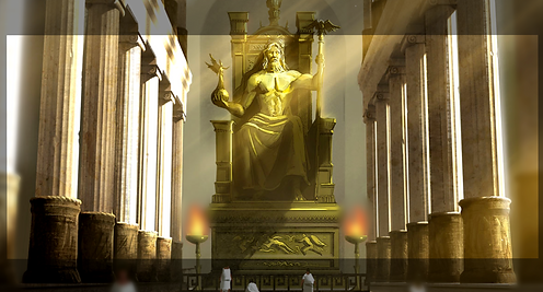
This shot was tricky, because the landmark featured doesn't physically exist anymore. The set in question is the statue of Zeus at Olympia in Ancient Greece, which I felt would be a really brilliant setting to include as it's one culture's representation of a god, and within the context of the video it's essentially how that culture has represented my character.
However, the statue of Zeus at Olympia no longer exists; the temple is in ruins and the statue isn't there. Obviously there isn't any footage of how it looked in Ancient Greece, and all that remains to represent the monument is Ancient Greek artwork. As such, the most realistic representation of it I could find was a conceptual artwork of how it might have looked.
One problem with this artwork is that it features flames, which present a problem similar to that of the waterfalls in the brachiosaurus scene; the flames are a still image and I need animated fire. To begin, I applied circular masks over the flames in the artwork and then used a gaussian blue to almost completely blur them out. I composited simple flame overlays on top, and then composited the same flames on top again on an additive layer and blurred them to give the flames a strong glow.
Adding myself in was another simple case of using a tracked mask around the edges of my body with increased warmth and exposure to simulate backlight, and then colour-composing the rest of the footage of my character to match the setting.


The Civil War scene is another shot that uses elements from a painting, but the difference is that the Zeus scene is a statue, whereas this scene takes place in the middle of a war and features human characters.
I needed to add motion to the characters, making the people in the painting appear as though they're moving. To do this, I isolated both sides, the American soldiers and the Confederate soldiers, into their own separate images using Photoshop. In After Effects, I blurred them all out of the original image and then composited the separate images of the two armies on top. From that point it was easy to animate their positions so that they move slowly towards one another, but they're still standing completely still and just gliding across the ground. I masked around their legs and added a very subtle twirl-distort effect to make them look as if their knees are bending in slow motion. Then I masked around all the flags and added a wave warp effect, making the flags look to be rippling in the wind. After that, it was just a matter of adding lots of smoke and colour grading to make the video bleak and grey.
I really wanted to exhibit mankind's descent into pure evil and chaos, and there are few groups more evil than the Klu Klux Klan.
This is another shot that's mostly made up of still images and and video simply layered over one another, but it has so many individual elements. To begin, I needed to find a location that's at least reminiscent of places that the KKK were most active during their most open and horrific period. The KKK were particularly prevalent in the Southern United Stated during the 50's and 60's, so I began by searching for a more rural location. Unfortunately, most of the settings that I really liked were in very poor quality footage or images so, despite the fact I'd be blurring the background anyway, I decided to pick a more suburban setting. I think it works just as well, and adds an extra element of acknowledging just how shockingly public the KKK were back then.
I added a very dense and heavy layer of embers and smoke in the background out of focus, and a layer of more lightly distributed in-focus embers in front of my character. I wanted there to be embers and smoke and fire throughout the entire depth of the shot, to make it clear that the KKK were just parading through the town en masse leaving fire in their wake.
Next I needed a Klansman himself. The image is actually of an empty KKK garb on a mannequin, and the cross is a separate image altogether, but both elements are out of focus for most of the shot, and with a little colour composition they looked perfect. Using imagery like this is always a very fine line to walk, but I feel that my visual style does well to make clear that the KKK are absolutely the villain, and that what they're doing is wrong, not glorified. Still, presenting imagery and content that's so relevant to the trauma of a lot of people has to be done as well as possible and as carefully as possible, so one has to be very mindful that they ensure they're portraying the imagery the way they want, in this case that the KKK are abhorrent. The same reasoning is why I had so much trouble choosing the right piece of footage to use to represent Nazi's in the video. I'm actually not 100% happy with the piece I chose, but I think my performance in the shot is enough to relay the feelings one should associate with such heinous characters.
The rest of this shot was entirely just adding more are more destructive fire effects, embers, ash, and sparks. I decided, rather than keep the Klansman out of focus, to have the focus slowly pull from my character to the Klansman so that he's in focus in the very last frame of the shot before the cut to the next scene. I think that helps to make the character seem even more threatening, and I really like how well it works with the lack of eyes behind the mask.


I watched a lot of footage of nuclear explosions to try and get this scene right, but despite the alarming, and frankly concerning, amount of videos of nuclear detonations available, no real piece of footage jumped out at me as much as the CGI nuke explosion featured in Indiana Jones and the Kingdom of the Crystal Skull.
In Crystal Skull, the titular Indiana finds himself in a 'nuketown', a replica town made for measuring the aftermath of nuclear explosion tests. He survives the explosion by hiding in a fridge, and then steps out, apparently immune to all fallout and radiation, into the shot pictured below.

When I composited the desert dunes on which my character stands atop the nuclear explosion footage I found, I immediately noticed that the dunes were lit from the wrong direction. The nuke being the brightest light source, the dunes would need to be backlit in the perspective of the shot. I inverted the colours of the dunes, when turned them blue but swapped the brightness and darkness around. From there I just had to tint the dunes red and boost the contrast, leaving me with perfectly realistically lit dunes.
I also had to silhouette my character, and add a shadow. Despite how smoky and under-contrasted the shot from Crystal Skull is, I decided to stick with my style for my shot and keep all the highlights and shadows very contrasted from one another, and keep the shot very saturated.
I also decided not to add any smoke or dust to the shot, despite the reality that there would be a huge shockwave and dust cloud. I really wanted the silhouette to be clear and dark, and the mushroom cloud not to be obstructed by anything, so it felt best to leave any atmospherics or fogs out of the shot.
Finally I added a lens flare on an additive layer to make the explosion as bright and fantastical as possible. This one was a little complicated as I had to go through it frame-by-frame subtly altering the brightness and opacity so that the flare stuttered and flashed, moving around with the shake of the explosion and the changing light of the fireball.
This scene was a bit of a bother because the perspective had to be inconsistent in order for it to work. When I originally envisioned the scene in my head it was a single shot that tracks around from the first angle pictured right to the front-on long shot at the bottom of the righthand images. My intention was for there to be a succession of planets and stars that would explode one-by-one as they pass through the frame until the shot settles on the front-on angle and the sun and moon explode. However, shooting on my own with a tripod on a very small green-screen made this nigh-on impossible, so I had to settle for two separate shots that are made to look like two angles of the same event. The perspective doesn't really work, as the positioning of the sun in the first angle would put it somewhere far out of the left-hand side of the frame in the next angle, but I have to admit that, despite the inconsistencies, I really like it.
For the most part it's a normal composition of layers, the sun at the bottom, the different explosion effect above, the character footage in the foreground, and the smoke overlay above that. The shot also incorporates the masked back-light effect, with a tracked mask around my shoulder and the far side of my face. The masked area actually gets brighter and more exposed over time as the sun brightens, then packs when the sun explodes and then gradually fades as the fireball does. I also used the 'spherise' distortion effect to make the sun warp and expand before exploding, in order for it to transition more fluidly into the explosion. I used the same effect on the moon before it explodes in the following shot.
The next shot is achieved all in mostly the same way, with layers of explosion effects in the background. There's also a rolling smoke effect overlayed over the dune in the foreground to give the impression of wind sweeping the sand.
The explosion of the moon is made up of three parts; a shockwave that spreads outwards towards the viewer, and two grenade blasts opposite one-another, which makes the explosion looks like the moon splitting in two and bursting outwards.
I keyed the lighting in the shot to change with the brightness and illumination of the explosions. The sun gradually brightens before it detonates, and as it does so the shot becomes more exposed and saturated. Once the explosion goes off, the brightness is at its peak, but as the sun fades away all colour leaves the shot, and everything gets darker and (slightly) less contrasted. I did a lot of thinking about how I could illuminate a sequence that has no artificial lights and no sun, as technically nothing would be visible at all. An early idea had the god character emitting his own light, and I had a vision for an extremely long shot of a completely barren and dull wasteland with only the glowing god in sight. But this was inconsistent with the rest of the video, so I decided instead to just have the ending sequence under-saturated and dimly lit.


The finishing touch I put on the video was to add a camera shake effect so that every shot would look like it was filmed handheld. This is a good way to give occurrences like explosions and earthquakes an effect on the viewer, making the video more immersive, but more importantly the illusion that everything was shot handheld makes all of the impossible green-screened and digitally composited elements seem more real, as it gives the appearance that a cameraman was really present in those environments.
I use Premiere Pro to do this. There's a way to add a 'wiggle' effect to footage in After Effects, but I find this method more realistic. First I took a piece of footage from a movie that was shot handheld, in this case a clip from Man of Steel, as it's very recognisably shaky. I layer the Man of Steel clip over my footage in Premiere, and the 'nest' the two pieces of footage together. Then I use the 'warp stabiliser' tool and set the tracking to 'no motion' by tracking position, scale, and rotation. What this does is stabilise the Man of Steel clip by matching it to the still footage below. But the nested sequence has to match the still footage to the shaky footage's movements to compensate, so when I enter he nested sequence and make the Man of Steel clip transparent, my footage is visible on the editing timeline and has the same camera movements as the original unstabilised Man of Steel clip.
Below is the finished product.
The War.

Halfway through editing, especially with something as special-FX heavy as this, I'm always struck by a lot of worry and doubt. In their unfinished stages a lot of digitally composed sequences look downright ridiculous, and I worry that they won't turn out any better. But in this case I was very pleasantly surprised. I'm overjoyed by how well the video turned out, almost across the board every scene is exactly the way I wanted it. There are only two shots in the video with which I'm actively unhappy; the short sequence in which my character puts his hand to the ground and grass forms around it. The expansion of the grass and the masking around it isn't very fluid or cleanly executed, and the chroma-keying in the first shot, the close up of the hand, is downright sloppy. However, every other shot and sequence as a whole cam together favourably.
I do feel that there's too much noise and grain in some shots, but often I had to include it to compensate for the poor quality of the source footage. I also feel that, as I so often do, I over-saturated and contrasted some shots. It's to my personal preference, and I'm not unhappy when shots turn out that way, but I can recognise that a different style might suit them more. I also feel that the shots set at night could have been executed better, and I was folly to shoot them in such bright outdoor lighting at such a high exposure, but I'm not unhappy with them. I've also noticed, in watching the video back here on Wix, that the compression quality has reduced the sharpness of the video considerably as it was uploaded to YouTube. This is often inevitable when uploading a video online, especially in a public format, but it still gets on my nerves.
The video comes together as a whole to make something that really captures everything I wanted it to. The narrative and the message are clear and most, if not all, of the digitally composed scenes that I worried wouldn't turn out well actually hold up and are very convincing. In watching the video back, I wonder if it might have benefitted from some subtle sound effects. It was an idea that I was holding onto, butI scrapped it in favour of focusing on the song. It's always bothered me personally when music videos include sounds that aren't present in the source song. In a music video, the song has lyrics, it has meaning. I feel like the focus in terms of audio should be on the non-diegetic in the case of a music video, unless the performer is in the video playing the song in a diegetic setting.
I do think, though this might just be because I have inside knowledge about which shots I cared about most, that many of the filler shots are very apparent, and of apparently different quality than the more cinematic ones. There are some shots that I was so inspired to do and do well, and that I envisioned so beautifully in my head, and then there were some shots that were just to fill space where I didn't have any terrific ideas, the shots with the pigeon and the whale being examples. I think they're obviously of lower quality and effort than shots like the exploding sun, the nuke, and the pyramids. That's not to say I don't like the outcome. I don't think there's anything in the video that I really dislike. Just that it's apparent to me, and I fear to the viewer, that there are fluctuations in motivation throughout, and that a lot of the difference in quality comes down to the shots that suit my preferred visual style having much more effort put into them.